Iguana – Applications
1 Introduction
1.1 What are applications?
Applications are the types of content that are supported by Iguana. Typical examples of applications are Rich Text Items, RSS feeds, animations and word clouds. The CMS allows you to create and manage instances of each of these application types.
At the front-end, applications are displayed as widgets. The applications can be included on multiple pages, i.e. the content is reusable and can be “shared” between pages and profiles.
1.2 Application types overview
Iguana supports the following application types that can be managed via the CMS menu section “Content – applications”.
· Rich Text Items (RTI)
· Animations
· RSS
· Search profiles
· Direct search & search filters
· Word cloud
· Logon
· Submenu
· Selfcheck loans/returns
These applications are all described in detail in this part of the documentation, with the exception of Search profiles and Direct search & search filters, which are described in the document on Search.
The following applications are also available, but are not (or indirectly) accessed via the “Content – applications” section of the CMS menu. These are:
· Search boxes – This application is defined as a Rich Text Item and is described in the chapter “Rich Text Items” in this document.
· iFrames – This application is defined as a Rich Text Item and is described in the chapter “iFrames” in this document.
· Forms (webforms) – This application is defined as a Rich Text Item and is described in the chapter “Forms (webforms)” in this document.
· Mashups – Mashups typically run “in an iFrame”, - and as such they fall in the iFrame applications category (e.g. Google Maps, Twitter feeds, and others). See the document on Mashups for more information on mashups in general and more specifically on mashups that do not fall in the “iFrame” category (e.g. cover images).
· Published content containers – This application is described in the document “Published content”.
· Published content items – This application is described in the document My Profile – This application inherits most of its settings from the V-smart WebOpac Preferences. In the Iguana CMS there are just a few properties that can be modified. These can be found under General & Tools > System parameters. My Profile is described in the document “My Profile”.
For each of these applications (with the exception of My profile), multiple instances can be created. The CMS is used to create and manage these instances, i.e. to define a set of properties, which are grouped in a number of property categories. The properties differ between the application types, but a number of property groups are typically shared between the types.
The property groups that are usually shared between the application types are:
Of these, three property groups always have the same properties: View permissions and restrictions, In use and Previous versions.
These three property groups are described apart from the application descriptions.
1.3 Application instance versions & life-time cycle
During its “life-time” an application instance can have multiple versions. These versions are either:
· Draft : a draft version
· Active : the current version
· Previous : one to ten previous versions
· Archive : when an application instance is deleted, it is not actually deleted, but archived.
The Previous versions section of the application properties display the previous versions as hyperlinks. To reinstate a previous version as the “current” (active) version: [1] click on the previous version (hyperlink) that you want to reinstate, and [2] click on the button.
To Archive a version: click on the button. This button is present on both the application instance overview page and on the application instance detail page. This action will only archive the current (active) version; all previous versions will be permanently removed.
To remove an archived version, you can open the archived version and delete it. This will permanently remove the instance.
To save your work as a Draft version, click on the button. This button is only available on the application instance detail page.
(If you save an application instance as a draft version, you can use this draft version to edit/revise the application instance's contents without directly affecting the production version of the application instance. When this draft application instance is then promoted to production status using the button, the existing production version will be archived and the draft version will become the production version.)
2 Managing applications
Select the option ‘Content - applications' from the left navigation pane on the Iguana CMS home page, the menu is expanded:
2.1 Application instances overview
If an application type is selected from the navigation menu, the list of existing instances of the chosen type is displayed. This display uses a generic element in the Iguana CMS, - the overview page of instances of a specific data type.
The application instances overview page is described in the chapter Instances overview page of the "Management common workflow" document.
2.2 Options on the application instances page
The options on the application instances overview page are described in the chapter Options on the instances overview page of the "Management common workflow" document.
2.3 How to create a new application instance
To create a new application instance, act as follows.
1. In the left pane, click on the application type of which you want to create a new instance. The application types can be found under the header “Content – applications”.
2. On the overview screen of existing instances, click on the button.
3. You will now be offered to enter the properties for the application type that you selected. The set of properties that can be defined depends on the chosen application type (e.g. RSS channels have other properties than animations, etc.).
4. Click on the button to save your work.
All steps in this process are described in detail in other sections of the documentation.
2.4 Application instance details page
If you select an existing application instance on the overview page, or if you start creating a new instance, the instance details page will be displayed.
This page displays all the property groups that are valid for the selected application type.
The following options are available:
· : to save the application instance
· : to save the application instance as a draft version (This draft version can be used to edit/revise the application instance's contents without directly affecting the production version of the application instance. When this draft application instance is then promoted to production status using the ‘' button, the existing production version will be archived and the draft version will become the production version.)
· : to copy an existing instance to a new one
· : to return to the overview page of the application instances
· : to expand (the display of) all property groups
· : to hide (collapse) all the property groups
· Changing application instance properties (this is, as opposed to the other options, not a button on the screen; the properties are displayed in the page and can be modified directly).
Each of these options is described in detail in the following section.
2.5 Options on the application instance details page
The following options are available on an application instance details page.
2.5.1 Save
To save the settings (properties) of an application instance: click on the button. This will have an immediate effect on the production version of the application instance. If you only want to save your changes without any changes to the production version, you can use the button.
2.5.2 Save as draft
If you want to save modified settings (properties) of an application instance as a draft version, click on the button.
This will save a draft version of the instance, i.e. the modified settings will not have any effect on the production version of the application instance.
2.5.3 Cancel
If you click on the button, you will return to the application instances overview. If there are any unsaved changes, a popup message (“There are unsaved changes – proceed? (if you proceed your changes will be lost)”.) will be displayed, and you will have to confirm if you want to proceed.
If you proceed (click on ) all unsaved changes will be lost, if you click on you will remain on the application instance details page.
2.5.4 Copy
In order to create a new instance based on an existing definition, you must first select the application instance you want to copy from. If you forget this, the system will display a warning that you must select a line from the overview screen with application instances before you can use the option.
If you click on the button, you will be asked to enter the id of the new application instance. Enter a valid application instance id and click on the button to store the new application instance.
After the copy, the application will switch to the display of the new application instance.
Please note
The copy option will copy the property values of the original application instance.
So if you want to create a new version, you must first use the copy option and give it a new name. You can then make changes to the copy, leaving the original version (the one you copied from) intact.
Do not make changes to the original version if you want to include those changes in the copied version, because there is no "Save as" option (by design) to then save it under a different name. If you start by making changes to the original and then realize you should have made a copy first, your only option is to cancel without saving changes.
2.5.5 Show / hide property groups
You can show or hide individual property groups by clicking on the property group's display name. This will either show or hide the properties in the group.
You can hide all properties by clicking on the button.
You can display all properties by clicking on the button.
When you click on the button, Iguana will automatically “remember” the last display settings for the application type (e.g. an animation, a RSS feed or a Rich Text Item), and reuse these if you access an application instance of the same type.
2.5.6 Modify properties
You can modify properties (or not) depending on the authorisation settings for the role that is (or roles that are) attached to your user account (read only – change – delete).
The application properties are described in detail in the following sections.
3 Generic application properties
The application details page shows all properties that are linked to the application type that you selected.
There are three property groups that are shared between most, if not all, data elements (pages, applications, etc.) and that always contain identical properties. These are:
· View permissions and restrictions
· In use
· Previous versions
These property groups are described in the chapter Generic instance properties of the "Management common workflow" document.
4 Properties and languages
If you are managing multi-language sites, you will want to enter some properties in multiple languages. This is typically the case for all texts and content that needs to be displayed in a specific language.
This topic is described in the chapter Properties and languages of the "Management common workflow" document.
5 Animations
Select the option ‘Content - applications' from the left navigation pane and then the option Animations, the list of existing definitions will be displayed.
5.1 What are animations?
Animations are, in this context, animated films created using Flash or JavaScript. Typically, the animations contain images, book covers and similar. Supported animations types are:
· rotating pictures
· rivers
· carrousels
· rolodexes
In this context, videos (MPEG or other) or animated GIF's are not animations.


River animation examples
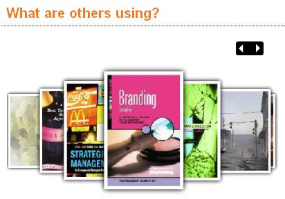
A carrousel animation example


A rotating picture animation example (picture 1 – picture 1 fades out – picture 2 fades in – picture 2)
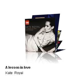
A rolodex animation example
5.2 Overview of property groups and options
Animations have the following property groups:
· Basic settings
· Advanced settings
· Preview
· View permissions and restrictions (*)
· In use by (*)
· Previous versions (*)
The property groups marked with (*) are described in the chapter Generic instance properties of the "Management common workflow" document.
The available options are the standard options (Save, Save as draft, Copy, Cancel, Show all and Hide all). These are described in the chapter Options on the instances overview page of the "Management common workflow" document.
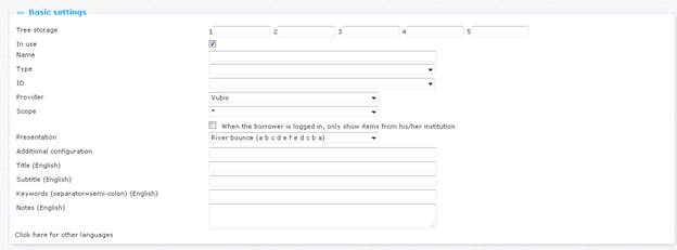
5.3 Basic settings
The basic settings of animations are:
|
|
Please note that not all these properties are always available. Some of these properties are related to one or more specific animation types. Properties are only displayed if they are relevant to the “active” animation type. |
The basic settings define the content of the animation and also encompass the most important properties of the animation's look & feel. (More specific properties related to the look & feel can be found in the Advanced settings section.)
Define the basic settings as follows:
Tree storage: The tree storage allows you to organize your content in a hierarchic folder structure. You can define a maximum of five levels in the storage tree.
|
|
The tree storage allows you to order content in a hierarchical tree structure with a maximum of five levels. If you want to add existing content to a Page e.g., you can select the content from a treeview. The tree storage allows you to organize content that is ordered via the tree storage. The tree storage is optional. Content that is not placed in the tree storage is added at the top level of the treeview. |
In use: You can set an application to Not in use. This implies that you cannot link the application to pages. Setting an application to Not in use does NOT imply that it is removed from views (pages).
Name: This is the unique name of the application instance.
Type: Select the animation's content type from the list. Supported content types are:
· New items : items that are new in the bibliographic metadata / holdings database of the back-end ILS; when you select this type you can then select a list from the ID field
· Savelist : a list of (manually or otherwise) selected items; when you select this type you can then select a user from the ID field (and subsequently a savelist of that user)
· Recently returned items : items that were recently returned in the back-end ILS
· Recently viewed items : items that were recently viewed in Iguana
· Picture list : a list of images; when you select this type you can select a Presentation (there will be no ID, Provider or Scope)
· Hot list : items that are included in a so-called “hotlist” in V-insight (you will only see this type when V-insight is installed on your system)
· XML file: a specific file type; when you select this type you can select a Presentation (there will be no ID, Provider or Scope)
· High rating: a list of items that have been given a high rating in Iguana
· Recently reviewed: A dynamic display of book cover images of items recently reviewed in Iguana – requires license with provider of book covers
· Specific mood: a list of items that have been assigned a specific mood; when you select this type you can then select a mood from the ID field (Moods are defined under General & Tools)
ID: This is the ID that defines the content of the animation; the format of this ID and the workflow to define it, depend on the content type; the ID's are:
· New items : an interest topic
· Savelist : a savelist of a specific user (you will first have to select the user from a dropdown list, and then afterwards the savelist)
· Recently returned items : ID is always “*”
· Recently viewed items : ID is always “*”
· Picture list : a list of images (select two or more images from the media server); use the button to select the images; this will open the Media Manager, and you can now select the image that you want to add)
· Hot list : a hot list
· XML file : an XML file that contains the content that should be loaded
Provider: For the time being, the Provider is always “Vubis”.
Scope: You can indicate for which “scope” the content needs to be created. This is either system-wide (expressed as “*”), or “Active location profile” or an institution/location combination. If you select an institution/location combination, the content will be restricted to items of the selected institution/location. If you select “Active location profile” the active location profile (and not a hard-coded one) will be applied.
|
|
The Scope property is only applied to animations of the “New items” type. |
When the borrower is logged in, …: When this option is checked, only the items belonging to the borrower's home institution will be displayed in the animation.
This works best if the previous parameter is set to Scope at system level. Scope differences may result in nothing being displayed
Presentation: Select the presentation type from the list of possible values. The supported presentation types are:
· River bounce : a "river" of images that automatically move from right to left ; when the end is reached, the direction changes from left to right, - and so on
· Carrousel : a carrousel of images that do not automatically move; the user can however navigate through the list of images via mouse clicks on the images that are not in the centre position
· Rolodex : a list of "standing" images that automatically "fall", so that the next image takes centre position
· Rotating gallery : a list of images that fade away, after which the next image from the list fades in
Additional configuration: Please contact Infor if you think additional configuration is required.
Picture list: If the content type is Picture list, you can select two or more pictures using the button ; please note that when you want to support the functionality that a user can click on an image to launch a URL (e.g. to access another page on the site), that you should use the XML file solution instead of the Picture list; the latter does not support clickable images
XML file (URL): the file name that contains the content for the animation, expressed as an absolute URL (e.g. http://www.somesite.com/iguana/Isthisthewaytoamarillo.xml); please see section 5.6 (Animation content stored in an XML file) for more information about the structure of the XML file
Title (English): This is the main title that is displayed as part of the animation.
Subtitle (English): This is the subtitle that is displayed as part of the animation. It is displayed in a smaller font than the main title.
Keywords (English): You can define keywords (tags) that are relevant for this application. These keywords will be inserted into the HTML page as meta tag keywords, which can improve your ranking in search engines (SEO).
Notes (English): You can add notes to the application instance. These notes are for internal use only; they are not displayed in the actual animation.
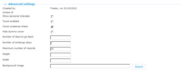
5.4 Advanced settings
The advanced settings of animations are:
Define these properties as follows:
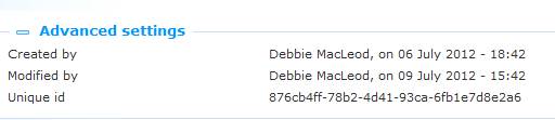
Created by: This is the person who created the animation instance and the date on which it was created. You cannot modify these properties.
Modified by: This is the person who last edited the animation instance and the date on which it was modified. You cannot modify these properties.
Unique id: This unique id of the animation is used for internal purposes only. You cannot modify it.
Show personal interests: If you set this property to Yes, the animation instance will give priority to new items for the interest topics that are in the user's interest profile. An Iguana user can create his own interest profile, consisting of one or more interest topics. New items for these interest topics will be included in the content of the animation and will get priority over “non-personal” new items.
|
|
This property is only relevant for animations that show content of the content type “New items” (i.e. items that are new in the collection). |
Touch enabled: Set this property to Yes if support for touch screens is required.
Cover presence check: Set this property to Yes if the application should check whether a cover if potentially available. Please note that this does NOT guarantee that a cover actually IS available; it only checks -at the server-side- if the necessary metadata are present in the metadata record to support the retrieval of a cover from a content provider. A typical example of the Cover present check is that the metadata record will be checked for the presence of an ISBN.
|
|
Please also note the following. Once the server-side application has concluded that it can generate a link to the cover information, it will store this information and not again perform the check. This is done for performance reasons. If the cover check failed the last time, it will be executed again (the assumption is that in the mean time additional metadata information may be available, enabling the application to generate the correct link this time). |
Hide dummy cover: In case there is no cover to be found, the system can display a default cover image. Set this property to Yes if you do not want the system to display a default cover image. In that case no image will be displayed at all.
Number of days to go back: This is how far the application should go back in time to check for new items (e.g. 7 is go back one week). [ This property is only relevant for new items. ]
Note
When you import entries for animations via a savelist, the system does apply the ‘backdate' parameter. To be safe, it is best to set this parameter to cover the period dating back to your original Vubis installation to be sure of getting all the items from the savelist displayed in Iguana's animations.
Number of embargo days: This is the number of days counting back from the present day that should NOT be included in the animation (e.g. 1 means: do not include yesterday's new items; 3 means: do not include the new items of the last three days, etc.). [ This property is only relevant for new items. ]
Maximum number of records: The maximum number of records that should be included in the animation. At server-side this number may be overruled by a maximum value. Please also note that, depending on the animation type, you should not set this value at a level that is too low. For rivers, we advise to set the minimum number of records to at least 1.5 times the number of covers that are visible in the animation at any single point (e.g. if six covers are visible, then set this value to at least 9, which is the absolute minimum).
Height: The height of the animation, expressed in pixels.
Width: The width of the animation, expressed in pixels.
Background image: The background image of the animation. You can use the button to open the Media manager and select an image that is present on the site's image server.
Please note
|
|
The content of animations is not updated each time an application is invoked. Typically, the system is configured to run an update of animations content once each day. Usually this is done in the early hours of the day. Recently returned items and Last viewed items, however, are update on-the-fly. |
5.5 Preview
The Preview section displays the animation and reflects the current settings of the animation instance properties.
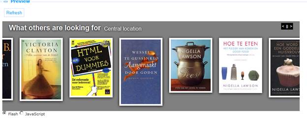
If you click on and then on , the animation will be loaded again to reflect any changes to the property settings.
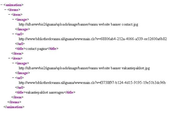
5.6 Animation content stored in an XML file
As explained in the section on Basic settings, animations can also retrieve their content from an XML file. This allows you to include basically any content. The XML file is accessed directly and is expressed in the CMS as an absolute URL (e.g. http://www.somesite.com/iguana/Isthisthewaytoamarillo.xml). This section contains information on the structure of the XML file. You can create the file by using any editor that is able to create or edit XML.
The XML file has a simple structure, that allows you to include a list of one or more items (see below for an example). For each of the items you can include three tags:
· image : the absolute URL of the image that needs to be displayed
· URL : the URL that needs to be accessed if the user clicks on the image
· title : the ‘title' of the image; this ‘title' is shown as the ALT or TITLE attribute of the image.
An example of an animation content XML file:
6 Rich Text Items (RTI's)
Select the option ‘Content - applications' from the left navigation pane and then the option Rich Text Items, the list of existing definitions will be displayed.
6.1 What are Rich Text Items?
Rich Text Items are “static” texts created with a so-called Rich Text Editor. A Rich Text Editor is a WYSIWYG editor (“what you see is what you get”) that allows you to create and manage “web-friendly” content (primarily formatted text, which may however also include images, videos and other types of multimedia).
See section 6.6 (Rich Text Editor) for more information.
|
|
Rich Text Items have a maximum length of 32.000 characters. This maximum length includes formatting characters. |
6.2 Overview of property groups and options
Rich Text Items have the following property groups:
· Basic settings
· Content
· Summary
· Advanced settings
· View permissions and restrictions (*)
· In use by (*)
· Previous versions (*)
The property groups marked with (*) are described in section 3 “Generic application properties”.
The available options are the standard options (Save, Save as draft, Copy, Cancel, Show all and Hide all). These are described in section 2.5 “Options on the application instance details page”.
6.3 Basic settings
The basic settings of Rich Text Items are:
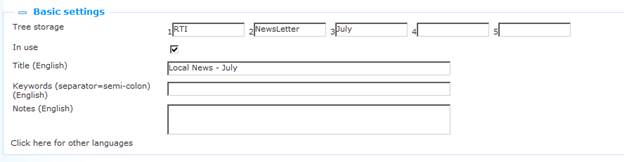
Define the basic settings as follows:
Tree storage: The tree storage allows you to organize your content in a hierarchic folder structure. You can define a maximum of five levels in the storage tree.
In use: You can set an application instance to Not in use. This implies that you cannot link the application to pages. Setting an application instance to Not in use does NOT imply that it is removed from views (pages).
Title (English): This is the title that is displayed in the header of the Rich Text Item.
A subtitle can be entered by adding '^^^' and the subtitle to the title of a RichTextItem. So if the title is this:
'title of widget'
only the main title will be shown, inside a span with class 'maintitle'.
When it is:
'title of widget^^^subtitle of widget'
both titles are shown, 'title of widget' inside a span with class 'maintitle' and 'subtitle of widget' inside a span with class 'subtitle'.
CSS can then be used to display the subtitle differently from the main title.
Keywords (English): You can define keywords (tags) that are relevant for this application. These keywords will be inserted into the HTML page as meta tag keywords, which can improve your ranking in search engines (SEO).
Notes (English): You can add notes to the application instance. These notes are for internal use only; they are not displayed in the actual application.
6.4 Advanced settings
The advanced settings of Rich Text Items are:
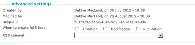
Created by: This is the person who created the RTI instance and the date on which it was created. You cannot modify these properties.
Modified by: This is the person who last edited the RTI instance and the date on which it was modified. You cannot modify these properties.
Unique id: This unique id of the RTI is used for internal purposes only. You cannot modify it.
When to create RRS feed: and RSS channel: these options are not yet in use.
6.5 Content and Summary
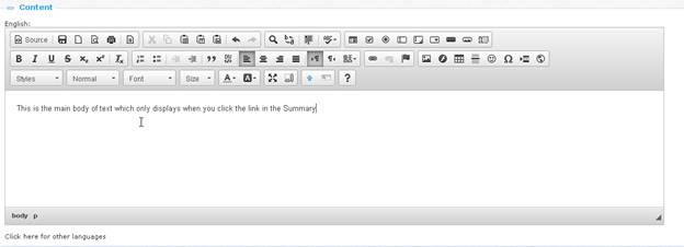
This is the actual (RTI) content that is displayed. The content may include text, images, videos and other types of content. Typically, this content is “static”, i.e. it does not change automatically: it only changes when it is edited via the RTE (Rich Text Editor).
The content can be defined in two property groups, one called “Content” and one called “Summary”. “Content” is used to define the full content, while “Summary” can optionally be used to define a shorter version of the content.
If Summary content is defined, it will be displayed in the Iguana front-end, followed by a link “Click here for more information”. If the link is clicked, the full content will be displayed.
If no Summary content is defined, the full content is displayed immediately.

The following screen shot shows an RTI summary. Please note the “read more” link at the bottom of the “How do I…?: Reserve an item” RTI widget at the left of the page.
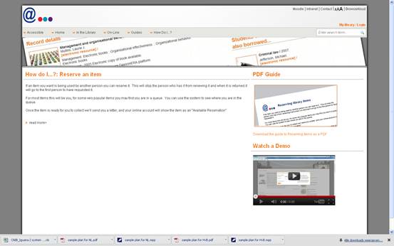
If you click on the “read more” link, the full content is displayed, which looks as follows:

At the end of the content is a “show less” link that can be used to “hide” the full content again and to “return” to the summary.
6.6 Rich Text Editor
To create and edit Rich Text Items (RTI's), Iguana offers an integrated Rich Text Editor. Iguana uses the CKEditor.
“CKEditor is a text editor to be used inside web pages. It's a WYSIWYG editor, which means that the text being edited on it looks as similar as possible to the results users have when publishing it. It brings to the web common editing features found on desktop editing applications like Microsoft Word and OpenOffice.” (from http://www.ckeditor.com).
The user documentation of CKEditor (English only) can be found at http://docs.cksource.com/CKEditor_3.x/Users_Guide. For your convenience and to illustrate the capabilities of the RTE, we include in this documentation a section from the Quick Reference guide (http://docs.cksource.com/CKEditor_3.x/Users_Guide/Quick_Reference) from the user documentation.
Working with a Document
|
Toolbar Button |
Description |
|
|
View or edit the source code of the document (for advanced users). |
|
|
Save the contents of CKEditor and submit its data to the server, when CKEditor is placed inside an HTML form. |
|
|
Clear the editing area and create a new page. |
|
|
Show a preview of the document in the shape that will be displayed eventually |
|
|
Select a layout template. |
|
|
Cut the selected text fragment to the clipboard. |
|
|
Copy the selected text fragment to the clipboard. |
|
|
Paste content copied to the clipboard along with formatting. |
|
|
Paste content copied to the clipboard without formatting. |
|
|
Paste content copied from Microsoft Word or similar applications along with formatting. |
|
|
Print document contents. |
|
|
Insert a page break. This only impacts the printed version. |
|
|
Check spelling of the document text or turn on the Spell Check As You Type (SCAYT) feature. |
|
|
Undo or redo the most recent action performed. |
|
|
Find a word or phrase in the document. |
|
|
Find and replace a word or phrase in the document. |
|
|
Select all contents of the document. |
|
|
Remove the formatting of the selected text. |
|
|
Maximize the editor in the browser window. |
|
|
Highlight all block-level elements in the document. |
|
|
Show information about CKEditor. |
|
|
To set the language for (part of the) text. Primarily meant for multi-lingual texts to support for instance screen readers and braille displays, |
Text Styling
|
Toolbar Button |
Description |
|
|
Apply bold, italic, underline or |
|
|
Apply superscript or subscript formatting to the text. |
|
|
Apply pre-defined combinations of various formatting options to block and inline elements. |
|
|
Apply pre-defined block-level combinations of various formatting options. |
|
|
Change the typeface of the text. |
|
|
Change the font size of the text. |
|
|
Change the color of the text. |
|
|
Change the background color of the text. |
Text Layout
|
Toolbar Button |
Description |
|
|
Increase or decrease text indentation. |
|
|
Format a block of text as indented quotation. |
|
|
Create a new |
|
|
Set text alignment (left, centred, right or justified). |
|
|
Set text direction as from left to right (default value for most Western languages) or from right to left (languages like Arabic, Persian, Hebrew). |
|
|
Insert a divider line (horizontal rule) into the document. |
Rich Text
|
Toolbar Button |
Description |
|
|
Create a numbered or bulleted list. |
|
|
Create or remove a hyperlink in the text. These features may also be used to manage file uploads and links to files on the web server. |
|
|
Insert a link anchor to the text. |
|
|
Insert an image into the document. |
|
|
Insert an Adobe Flash object into the document. |
|
|
Create a table with the defined number of columns and rows. |
|
|
Insert an emoticon image (smiley or icon). |
|
|
Insert a special character or symbol. |
|
|
Insert an inline frame ( |
|
|
Insert navigation menu (Iguana specific) |
|
|
Insert search box (Iguana specific) |
Form Elements
|
Toolbar Button |
Description |
|
|
Insert a new form into the document. |
|
|
Insert a checkbox into the document form. |
|
|
Insert a radio button into the document form. |
|
|
Insert a text field into the document form. |
|
|
Insert a multi-line text area into the document form. |
|
|
Insert a selection field into the document form. |
|
|
Insert a button into the document form. |
|
|
Insert an image button into the document form. |
|
|
Insert a hidden field into the document form. |
Iguana specific features
Although Iguana uses CKEditor for creating and editing Rich Text Items (RTI's), it adds a number of specific features to it. These are:
· the Add hyperlink form is extended with a “Hyperlink requires logon” feature; if you check this box (i.e. set the value to Yes), the target destination of the hyperlink will only be accessible to users who are logged on; if a user who is not logged on, click on such a hyperlink, the logon popup will automatically be invoked
· an additional editor feature “Insert navigation menu” is available; this is described in the chapter Page header in the document on Pages & Profiles
· an additional editor feature “Insert search box” is available; this is described in the chapter “RTI” search boxes: client-side configuration of the document on Search.
6.7 Images
When you include images in a Rich Text Item, please be aware of the fact that the larger an image is, the longer it will take for the page (that includes the Rich Text Item) to load. The Rich Text Editor allows you to specify the width and height of an image as you include it in the Rich Text Item, but this is an option that you should not use, - or only very rarely. This option basically tells the browser at which size the image should be displayed and does not actually resize it. Or in other words: the full image is still downloaded by the browser, which may take a long time for large images.
Instead of specifying a width and height you should resize the image to a smaller size with software such as PhotoShop, Paint Shop Pro, GIMP or similar applications, and insert the resized image in the Rich Text Item.
Furthermore, you should not use just any image format. For inclusion in a web page, JPG, PNG and GIF are the most advised image formats.
7 RSS channels
Select the option ‘Content - applications' from the left navigation pane and then the option RSS, the list of existing definitions will be displayed.
7.1 What are RSS channels?
RSS channels are web feeds that are used to publish frequently updated works such as blog entries, news headlines and others (see http://en.wikipedia.org/wiki/RSS for more information).
Iguana contains an RSS reader. This RSS reader accesses the RSS channel and displays the feeds that are returned by the RSS channel.
The RSS reader supports multiple RSS “formats”:
· RSS 0.90
· RSS 0.91 (Netscape)
· RSS 0.91 (Userland)
· RSS 0.92
· RSS 1.0
· RSS 2.0
· Atom 0.3
· Atom 1.0
· [and others]
Please note
|
|
The RSS channel application is not about how information from Iguana or the server-side ILS is published as RSS feeds, but how Iguana can incorporate RSS feeds from “external” RSS channels in its front-end. Information on Iguana RSS channels can be found here: · the chapter Interests RSS feeds in the document on Interests · the chapter Published content RSS feeds in the document on Published content |
7.2 Overview of property groups and options
RSS channels have the following property groups:
· Basic settings
· Preview
· View permissions and restrictions (*)
· In use by (*)
· Previous versions (*)
The property groups marked with (*) are described in section 3 “Generic application properties”.
The available options are the standard options (Save, Save as draft, Copy, Cancel, Show all and Hide all). These are described in section 2.5 “Options on the application instance details page”.
7.3 Basic settings
The basic settings of RSS channels are:
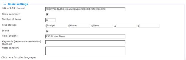
Define the basic settings as follows:
URL of RSS channel: This is the URL of the RSS channel (e.g. http://www.nu.nl/feeds/rss/algemeen.rss).
Show summary: An RSS feed typically consists of (amongst others) a title and a summary. If you set this property to Yes, the display will automatically show the summary under the title of the feed. If you set this property to No, the display will only show the title of the feed and you can view the summary by clicking on the expand icon before the title.
Number of items: This is the number of RSS feeds that need to be included in the display of the RSS channel.
Tree storage: The tree storage allows you to organize your content in a hierarchic folder structure. You can define a maximum of five levels in the storage tree.
In use: You can set an application instance to Not in use. This implies that you cannot link the application to pages. Setting an application instance to Not in use does NOT imply that it is removed from views (pages).
Title (English): This is the title that is displayed in the header of the widget that displays the RSS feeds.
Keywords (English): You can define keywords (tags) that are relevant for this application. These keywords will be inserted into the HTML page as meta tag keywords, which can improve your ranking in search engines (SEO).
Notes (English): You can add notes to the application instance. These notes are for internal use only; they are not displayed in the actual application.
7.4 Preview
The Preview section accesses the RSS channel and displays the returned information. The display will reflect the current settings of the RSS channel instance properties.
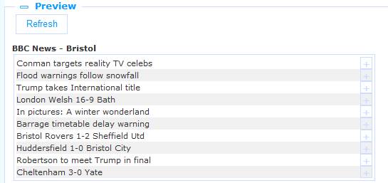
If you click on , the RSS channel will be accessed again and the display will reflect any changes to the property settings.
8 Word clouds
Select the option ‘Content - applications' from the left navigation pane and then the option Word clouds, the list of existing definitions will be displayed.
8.1 What are word clouds?
A word cloud (also called tag cloud) is a visual representation of textual data (“tags”) in a cloud-like display. These tags can be one or more words. The tags are hyperlinks and their size indicates their relative importance (within the set of tags in the cloud).
In Iguana word clouds can contain three types of tags:
· hyperlinks to pages in the current Iguana site
· hyperlinks to search results : a search action is executed
· hyperlinks to “external” pages (pages outside of the current Iguana site).
8.2 Overview of property groups and options
Word clouds have the following property groups:
· Basic settings
· Advanced settings
· Preview
· Items
· View permissions and restrictions (*)
· In use by (*)
The property groups marked with (*) are described in section 3 “Generic application properties”.
The available options are the standard options (Save, Save as draft, Copy, Cancel, Show all and Hide all). These are described in section 2.5 “Options on the application instance details page”.
8.3 Basic settings
The basic settings of word clouds are:
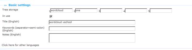
Define the basic settings as follows:
Tree storage: The tree storage allows you to organize your content in a hierarchic folder structure. You can define a maximum of five levels in the storage tree.
In use: You can set an application instance to Not in use. This implies that you cannot link the application to pages. Setting an application instance to Not in use does NOT imply that it is removed from views (pages).
Title (English): This is the title that is displayed in the header of the widget that displays the word cloud.
Keywords (English): You can define keywords (tags) that are relevant for this application. These keywords will be inserted into the HTML page as meta tag keywords, which can improve your ranking in search engines (SEO).
Notes (English): You can add notes to the application instance. These notes are for internal use only; they are not displayed in the actual application.
8.4 Advanced settings
The advanced settings of word clouds are:
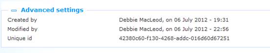
Created by: This is the person who created the word cloud instance and the date on which it was created. You cannot modify these properties.
Modified by: This is the person who last edited the word cloud instance and the date on which it was modified. You cannot modify these properties.
Unique id: This unique id of the word cloud is used for internal purposes only. You cannot modify it.
8.5 Preview
The Preview section displays the word cloud. The display will reflect the current settings of the word cloud instance properties.
If you click on , the word cloud will be displayed again and the display will reflect any changes to the property settings.
Please note
|
|
Please note that the Preview is an approximate view of how the word cloud will be displayed in the actual front-end of the site. Due to multiple reasons, such as width and height of the word cloud container, the actual display may vary significantly. |

A word cloud preview in the CMS

A word cloud in the Iguana front-end.
8.6 Items
Items are the tags that are included in the word cloud. There are no technical limits on the number of items that you include in a cloud (you can include hundreds of tags if you want to).
8.6.1 Items overview
The items are displayed in list format. The following options are available for each item in the list: you can click on the item Title (hyperlink) to access and edit the details of the item.
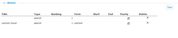
You can click on the icon at the end of each line to delete an item from the list.
The button at the top of the list can be used to add an item to the word cloud.
8.6.2 Item properties
Word cloud items have the following properties:
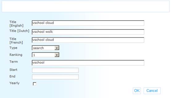
Define these properties as follows:
Title (language): The display “title” of the item, i.e. the text that is actually displayed in the word cloud. This “title” is defined per language.
Type: The Type property determines, together with the Term property, what happens if a user clicks on an item in the cloud. The supported types are:
· link : hyperlinks to pages in the current Iguana site
· search : a search action is executed
· open : hyperlinks to “external” pages (pages outside of the current Iguana site).
Ranking: Each item is ranked from 1 to 10. 1 is the highest ranking; 10 is the lowest ranking. The higher the ranking, the bigger the display of the item in the word cloud. Please note however that the actual display (colour, size, etc.) of the item depend on the settings in the CSS definitions (and as such -theoretically- does not need to correspond to the ranking).
Term: The “term” is the property that, together with the value of the Type property determines what happens if you click on a tag in the cloud. Depending on the value of the Type property, term is:
· link : hyperlinks to pages in the current Iguana site, starting with the www.main.cls prefix (e.g. “www.main.cls?sUrl=newacq”)
· search : the search term [please note that the search settings that are used are those that Iguana uses for its default searching; typically this is a keyword search in the all words index without any restrictions] (e.g. “harry potter”)
· open : the full URL of the page that needs to be opened starting with the http:// prefix (e.g. “http://www.youtube.com”)
Start: The start date on which the item needs to be included in the cloud. If you leave this value empty, the item will be included immediately after you save the word cloud instance settings. If a start date is defined, the item will not be included in the word cloud until the start date is reached. This property can be used to activate items in the cloud on a specific date. [See also the End and Yearly properties.]
End: The end date until which the item is included in the cloud. After this date, the item will no longer be included in the word cloud. If you leave this value empty, there is no end date. [See also the Start and Yearly properties.]
Yearly: If you set this property to Yes, the Start and End date will be applied each year, i.e. the start and end dates define a period that is applied each calendar year. This can be useful to include in a cloud items that are only relevant for specific periods, e.g. each year you want the “Christmas” tag to appear from December 1 until December 31.
When you select an item from the list, the properties are displayed in a popup pane. You can edit the properties. Click to save the new settings; click to return to the item overview without saving the changes.
9 Logon
Select the option ‘Content - applications' from the left navigation pane and then the option Logon, the list of existing definitions will be displayed.
9.1 What is Logon?
Logon is the application that allows a user to logon. The user identifies himself using his credentials.
The main settings of Logon are determined by the back-end ILS settings.
The Logon application itself gives you the ability to define Texts that precede and follow the actual controls that facilitate the logon (e.g. Username / Password).
9.2 Overview of property groups and options
Logon instances have the following property groups:
· Basic settings
· Advanced settings
· View permissions and restrictions (*)
· In use by (*)
· Previous versions (*)
The property groups marked with (*) are described in section 3 “Generic application properties”.
The available options are the standard options (Save, Save as draft, Copy, Cancel, Show all and Hide all). These are described in section 2.5 “Options on the application instance details page”.
9.3 Basic settings
The basic settings of Logon instances are:
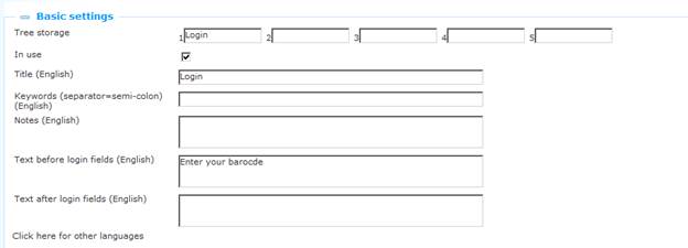
Define the basic settings as follows:
Tree storage: The tree storage allows you to organize your content in a hierarchic folder structure. You can define a maximum of five levels in the storage tree.
In use: You can set an application instance to Not in use. This implies that you cannot link the application to pages. Setting an application instance to Not in use does NOT imply that it is removed from views (pages).
Title (English): This is the title that is displayed in the header of the Logon widget.
Keywords (English): You can define keywords (tags) that are relevant for this application. These keywords will be inserted into the HTML page as meta tag keywords, which can improve your ranking in search engines (SEO).
Notes (English): You can add notes to the application instance. These notes are for internal use only; they are not displayed in the actual application.
Text before login fields (English): This text will be displayed before the actual logon fields. You can use HTML tags in the text.
Text after login fields (English): This text will be displayed after the actual logon fields. You can use HTML tags in the text.
9.4 Advanced settings
The advanced settings of Logon instances are:
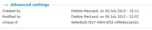
Created by: This is the person who created the Logon instance and the date on which it was created. You cannot modify these properties.
Modified by: This is the person who last edited the Logon instance and the date on which it was modified. You cannot modify these properties.
Unique id: This unique id of the Logon instance is used for internal purposes only. You cannot modify it.
10 Submenu
Select the option ‘Content - applications' from the left navigation pane and then the option Submenu, the list of existing definitions will be displayed.
10.1 What is a Submenu?
The submenu application is a widget that can be added on a page.
The widget will show the contents of the submenu (in the main navigation) where the active page is at.
If the page occurs at two different points in the menu (say) then the contents of the first submenu where the page is at will be displayed (the application cannot detect where the user clicked).
When creating a submenu, the number of levels can be specified. This denotes the number of levels in the (main menu) submenu that it will display in its own list.
If the page does not occur in a submenu the widget will hide itself.
10.2 Overview of property groups and options
Submenu instances have the following property groups:
· Basic settings
· View permissions and restrictions (*)
· In use by (*)
· Previous versions (*)
The property groups marked with (*) are described in section 3 “Generic application properties”.
The available options are the standard options (Save, Save as draft, Copy, Cancel, Show all and Hide all). These are described in section 2.5 “Options on the application instance details page”.
10.3 Basic settings
The basic settings of Submenu instances are:
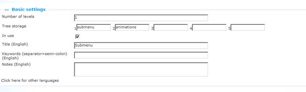
Define the basic settings as follows:
Tree storage: The tree storage allows you to organize your content in a hierarchic folder structure. You can define a maximum of five levels in the storage tree.
In use: You can set an application instance to Not in use. This implies that you cannot link the application to pages. Setting an application instance to Not in use does NOT imply that it is removed from views (pages).
Title (English): This is the title that is displayed in the header of the Submenu widget.
Keywords (English): You can define keywords (tags) that are relevant for this application. These keywords will be inserted into the HTML page as meta tag keywords, which can improve your ranking in search engines (SEO).
Notes (English): You can add notes to the application instance. These notes are for internal use only; they are not displayed in the actual application.
10.4 Example
Say you want a submenu for locations, that is displayed on all pages.
Steps:
· You should already have the locations in a submenu of the main navigation.
· Then add a (the same) submenu widget to all the location pages.
· The same submenu widget will be placed on all pages.
Behaviour:
· When the page is loaded the widget checks if the page has a link in the main navigation.
· If so if will display the links from that submenu.
· If not it will simply hide itself.
· If the page is in multiple submenu's it will show the data from the first available submenu.
11 Selfcheck loans/returns
Select the option ‘Content - applications' from the left navigation pane and then the option Selfcheck loans/returns, the list of existing definitions will be displayed.
11.1 Introduction
It is possible to loan items via the Iguana front-end. There are two possible workflows:
Workflow 1 (user is logged on):
a. A user goes to his My Profile page.
b. There he/she has the option “Loan items”.
c. When activated, he/she can scan or type one or more items. After he has scanned the item or typed the item, the user will see the title and due date. [When unsuccessful, a clear error message is displayed.]
d. The items will be on loan to the user after he/she has scanned the item (i.e. not only when the form is submitted), i.e. there is a “commit” after each item.
Workflow 2 (anonymous):
a. A widget can be placed anywhere in the site.
b. The user can scan his library card (or type his library card number). After he has scanned the card, the name of the user will appear.
c. From here on the workflow is identical to the one mentioned above (steps c. and d.).
d. The widget will contain a very clear message “Click here after you have checked out all the items”. Clicking on this the user name will be “erased”. If the user does not click the button the widget will “erase” the user name (i.e. erase the user from the session) after a time-out of n minutes (the value of n is a parameter; if not defined, the default time-out is 3').
In addition it is possible to allow the user to return items.
Workflow:
a. A widget can be placed anywhere in the site.
b. The user enters the barcode(s) of the item(s) to be returned.
c. The items that are returned are listed with Title (ItemBarcode) as part of the footer.
The layout for a self-service widget for Return is defined in the template SelfCheckLoans.returnform and it can be customized.
11.2 Overview of property groups and options
Selfcheck instances have the following property groups:
· Basic settings
· Advanced settings
· View permissions and restrictions (*)
· In use by (*)
· Previous versions (*)
The property groups marked with (*) are described in section 3 “Generic application properties”.
The available options are the standard options (Save, Save as draft, Copy, Cancel, Show all and Hide all). These are described in section 2.5 “Options on the application instance details page”.
11.3 Basic settings
The basic settings of Selfcheck instances are:
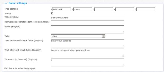
Define the basic settings as follows:
Tree storage: The tree storage allows you to organize your content in a hierarchic folder structure. You can define a maximum of five levels in the storage tree.
In use: You can set an application instance to Not in use. This implies that you cannot link the application to pages. Setting an application instance to Not in use does NOT imply that it is removed from views (pages).
Title (English): This is the title that is displayed in the header of the Selfcheck Loans or Returns widget.
Keywords (English): You can define keywords (tags) that are relevant for this application. These keywords will be inserted into the HTML page as meta tag keywords, which can improve your ranking in search engines (SEO).
Notes (English): You can add notes to the application instance. These notes are for internal use only; they are not displayed in the actual application.
Type: Select either Loan or Return from the dropdown list.
Text before self check fields (English): This text will be displayed before the actual self-service fields. You can use HTML tags in the text.
Text after self check fields (English): This text will be displayed after the actual self-service fields. You can use HTML tags in the text.
Time-out (in minutes): The number of minutes after which a self-service sessions will be terminated (when the user himself does not terminate the session by clicking on the relevant link for this).
11.4 Advanced settings
The advanced settings of Selfcheck are:
Created by: This is the person who created the selfcheck loans instance and the date on which it was created. You cannot modify these properties.
Modified by: This is the person who last edited the selfcheck loans instance and the date on which it was modified. You cannot modify these properties.
Unique id: This unique id of the selfcheck loans is used for internal purposes only. You cannot modify it.
12 iFrames
12.1 Iguana and iFrames
An iFrame is an HTML tag that allows you to include another HTML document in a frame. This allows you to open a web page inside another web page.
Iguana's front-end framework supports the iFrame technique to include documents (widgets) that are non-native to Iguana. Please note that this is not the only technique used by Iguana to include such content (other supported techniques include content that is placed in <DIV>'s).
Although the technique is very powerful and allows you to include basically any content from any website into the Iguana front-end, you should note the following:
You should think of an <iframe> as basically another browser window (another browser session), which means that communication with the <iframe> is much more difficult than with other widget containers. In principle, you should assume that communication with the content and functionality of the <iframe> is not possible.
There is a risk that you include content which is visually different from the overall look and feel of your site. Although it is technically possible to include literally any site / widget / HTML document in an <iframe>, most sites will not be able to resize / format to the desired width of the <iframe> widget container in Iguana. Furthermore, it may not be possible to apply a theme (CSS) to the content of the HTML that you want to include.
Below we include two examples of successful iFrame integrations (Google Maps and Twitter tweets). Both are successful because both these are designed as widgets that can be styled (up to a certain level) by the ‘host' environment (in this case two Iguana sites).
iFrame examples:
The Google Maps widget at the right of the page is integrated via the iFrame technique.

The Twitter tweets widget (“Follow us on twitter”) at the right of the page is included via the iFrame technique.
In the CMS, iFrames are defined as Rich Text Items, i.e. via the Rich Text Editor.
12.2 Integrating iFrames in Iguana
To integrate an iFrame in the Iguana framework, act as follows.
1. On the Iguana home page, select the “Rich Text Items” option under Content – applications from the navigation menu. This will display all existing Rich Text Items (RTI's).
2. If you want to edit an existing iFrame, select it from the list. If you are going to add a new iFrame application, click the button.
3. The RTI details will be displayed. To define or edit the iFrame details, open the Rich Text Editor in the Content section.
4. Click on the button in the button bar of the Rich Text Editor ( ).
).
5. This will open a popup form that allows you define the iFrame properties.
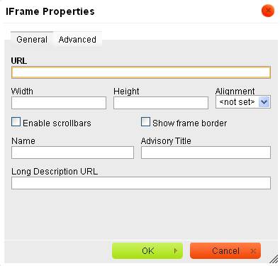
See the next section for a description of fields that you need to define to insert an iFrame. Please note that in most cases you only need to define a few of the properties that are displayed in the popup form.
6. Click on and then save the changes by clicking on the (or ) button on the RTI's details page.
Alternatively, you can define the iFrame code by using the button:
1. Follow the first three steps of the previous workflow.
2. Click on the (HTML) button in the button bar of the Rich Text Editor ( ).
).
3. Enter the HTML code of the iFrame in the editor. See the next section for a description of the syntax and a few examples.
4. Save the changes by clicking on the (or ) button on the RTI's details page.
12.3 iFrames syntax and examples
The generic code to integrate an iFrame is:
<iframe width="95%" height="400" frameborder="no" src="{URL}"></iframe>
Define the iFrame properties as follows:
|
HTML attribute |
Explanation and comments |
Input form field (see previous screen shot) |
|
width |
The width of the iFrame. You should define the width as a relative value and not as an absolute value. Setting the value of width to 100% implies that it will fill as much space as is available within the widget container. The actual width of the widget is defined in the template and/or CSS; this is why the value of the iFrame itself should be relative: that way it will nicely fit in with the width of the widget container. In some cases you may want to set the value of the width property to a value that is slightly smaller than 100% (see the Google Maps example below), because it may result in a cleaner display. Setting the width to e.g. 95% can result in very small borders being shown in the widget container, resulting in a nicer display. |
Width |
|
height |
The height of the iFrame. Because Iguana does not know what the content of the iFrame will be, there are no clear rules as to what the value of the height property should be. So in practice it will require a ‘trial and error' approach to come up with the best possible value. In almost all cases you will want to avoid that the iFrame is shown with a scroll bar. |
Height |
|
frameborder |
Typically, this value will be set to “no”, - which implies that the iFrame has no border. The iFrame is displayed in the Iguana front-end inside a widget container, which may have its own border (which is defined at CSS level). For this reason, the iFrame itself will almost always have a value of “no” for the frameborder property. |
Show frame border |
|
Src |
Any valid URL; its syntax will depend on the individual case (see below for a few examples) |
URL |
Examples of iFrame integration are:
· Google Maps: <iframe width="95%" height="400" frameborder="0" src="www.map.display.cls"></iframe>
· Twitter feeds: <iframe width="100%" height="380" frameborder="0" src="/iguana/php/twitter.php?twitter=BiebBreda"></iframe>
See the chapter on Practical examples in the document on Mashups for detailed configuration information of Google Maps and Twitter feeds
Please note
|
|
An iFrame can have other properties than the ones that are included in this table. However, in most cases the abovementioned properties will be sufficient to include the iFrame in a correct way. |
13 Forms (Webforms)
Please note
|
|
This section of the documentation assumes that the reader is familiar with Iguana, the CMS behind Iguana and the Rich Text Editor used with Iguana. This section is relatively very technical and creating forms is not always trivial. Experience with programming and programming logic is not required, but will help in understanding several concepts and implementation aspects. |
|
|
Therefore, most readers will want to skip this section. |
13.1 Iguana and Forms (Webforms)
A form (or webform) is a part of a web page that allows the user to enter data. This data is then sent to the server for further processing. Forms consist of one or more check boxes, text fields or radio buttons. The user fills in the fields in the form and submits them. The content is then sent to the server, where the input is tested.
The forms that are supported by Iguana can lead to two different actions:
1. The input is used to populate an email that (on submit of the form) is sent off to a predefined email address
2. The input is used to create a URL that (on submit of the form) is launched in a separate browser window
This section of the documentation describes how you can create forms. Forms are created using the Rich Text Editor. Typically forms are part of a Rich Text Item instance in an existing Iguana application. This section mainly describes the specific naming conventions that are used for assigning functionality to the form, and several remarks and caveats are included. It also explains how to take care of accessibility. There will also be a brief description of the internal logic behind the form and its handlers.
13.2 Explanation of logic
This section explains the basic logic behind the forms, - and how elements describe functionality and thus can affect the logic. More in-depth explanation for each of these elements and functionalities is available with the descriptions of each element below.
Technically, forms in Iguana are supported by a combination of HTML, JavaScript and server-side code.
When a form is submitted, a JavaScript function is run. This script submits the form, rather than using a direct (“normal”) form submit. The script loops over all form elements within the form and checks their respective names. Based on the name it decides what to do with the value of the form element and how to store it for submitting.
There is a special (hidden) element called ‘formaction'. The value of this element describes what the form should do. At the moment two values are supported.
When it is ‘openurl', it means the form details should be sent to a URL that is also defined in the form, - with the form specified parameters appended as URL parameters.
When it is ‘sendmail' (or any other value at the moment), the general form handler on the server is called for sending it to the server. These details are stored inside an object. This object is then sent to the server. From there on the server determines what to do. It will typically send the supplied data to the generic form handler (this is the only option at this moment). This will once again go through the data and determine what to do. If it recognizes the identifier for a specific piece of data it will deal with it accordingly, - otherwise it is treated as part of the data that needs to be stored/sent/etc, basically data that the user has entered before submitting the form. The email will be sent using details specified in the Iguana preferences. The body of the email message can be altered from the System texts module in the CMS, under the ‘SMTP' module, in the ‘mailmessage' text. In this text, the ‘${details}' token is used to dynamically insert the details that were entered in the form.
Editor settings related to forms
|
|
It is possible to use a general site-wide setting to make sure created form elements do or do not use dojo, the JavaScript framework that is used by Iguana in its front-end framework. This setting can be changed by Infor if needed. Under normal circumstances this is not necessary. The setting has an effect on the DOM structure of the HTML document. Please note that changes to this setting are not backwards compatible and never have an effect on existing forms, - not even if they are saved again. |
13.3 Creation of a form
This section describes how to create a form and how to assign functionality to (parts of) the form.
The scripts that are used when submitting a form depend on the values that have been assigned to the ‘name' attribute of the various elements within the form. This section describes the various types of functionalities / form elements and how they can be assigned using their respective naming convention.
Whenever ‘XXX' is used in the following sections, it is assumed this will be replaced by the appropriate name selected by the creator of the form.
To create a form, use the  button. The name that is given to the form should be of the form form_XXX. This will generate the following code:
<form name="form_XXX" method="get" onsubmit="return handleForm(this);">
</form>
13.4 Hidden form elements
This section describes the various hidden form elements. These elements are used to describe the logic and functionality of the form. All of these elements can be made using the  button. The generated code will look like this:
<input type="hidden" name="XXX" value="value_of_XXX" />
or
<input type="hidden" name="hidden_XXX" value="value_of_XXX" />
formaction
Element name: formaction
Possible values: openurl | sendmail
This element describes the type of the form. At the moment only two types are supported, openurl and sendmail.
urlToOpen
Element name: urlToOpen
Required: When formaction is set to openurl
Possible value: A valid URL
This element describes the URL that will be opened after submitting the form. Values from other fields in the form can be inserted into this URL using the [[XXX]] notation. So for instance if there is an input field called searchTerm that the user can edit, the value that the user has entered can be inserted into the URL using the [[searchTerm]] string inside the URL.
target
Element name: target
Required: When formaction is set to openurl
Possible value: A valid target, such as _new or _self
This element describes the target that will be used when calling urlToOpen.
See e.g. http://www.w3schools.com/tags/att_a_target.asp for possible values of the target attribute.
mandatory
Element name: mandatory
Possible value: comma-separated list of mandatory fields
This element describes the mandatory fields of the form, that is, the visible / user editable elements of the form that need to be filled in / have a value before the form can be submitted. For each mandatory field it holds the name of that field minus the type of the field, separated by a comma. For instance if the field input_name is mandatory (this would be an input field) name would have to be present inside mandatory's value.
|
|
In Iguana version 2 there is no possibility to perform additional checks on fields. The ‘mandatory' fields check merely ensures that all fields listed are non-empty when submitting a form. So there are no facilities to test for validity of an entered email address or other such validity tests. |
replaceselect
Element name: replaceselect
Possible value: comma-separated list of options and replacing values.
This element is used when one or more dropdown boxes in the form (select element) need to have a value sent that might be different from the displayed name for a selected option. For instance, if there's a dropdown box and one of its options has a name ‘Library Breda' and this is the option chosen by the user, the text ‘Library Breda' will be used as the value for the dropdown box. However, if the value should be its branch code, say ‘BB', this can be set inside replaceselect as follows: ‘Library Breda^BB'. The character ‘|' is used as a delimiter for separate elements, if another replace is set as ‘Library Roosendaal^BR', replaceselect will look like: ‘Library Breda^BB|Library Roosendaal^BR'.
|
|
This construction is necessary because of the usage of the dojo ‘FilteringSelect' widget which replaces the HTML select. |
order
Element name: hidden_order
Possible value: comma-separated list of all fields that (possibly) contain data for the form
This element is used when the order in which the visible / user editable fields as it appears in the email needs to be customized, i.e. be different from the default alphabetical order (if you do not use this field, the fields will be processed in alphabetical order).
For each field it holds the name of that field minus the type of the field, separated by a comma. For instance, if the field input_name is mandatory (this would be an input field) name would have to be present inside mandatory's value.
|
|
This property is only relevant for emails (formaction is sendmail). The property is not used when formaction is set to openurl. |
|
|
Please be aware of the fact that all fields must be included in the order list. If you omit any fields from the order list, those fields will not be processed. |
success
Element name: success
Possible value: string
After the form has been submitted successfully the value of the success field, if set, is displayed to indicate that the form has indeed been submitted successfully. How this message is displayed, depends on the existence of a <div> with the id attribute message_XXX where XXX is the name of the form (or the last part of the name if name holds an underscore _).
failure
Element name: failure
Possible value: string
After the form has been submitted unsuccessfully the value of the failure field, if set, is displayed to indicate that the form has indeed been submitted unsuccessfully. How this message is displayed, depends on the existence of a div with the id attribute message_XXX where XXX is the name of the form (or the last part of the name if name holds an underscore _).
to
Element name: hidden_to
Possible value: email address(es)
This value holds a list of email addresses. When formaction is set to sendmail, this value will be used for the resulting email's to field. Multiple email addresses can be separated using either a comma (‘,') or a semi-colon (‘;'); mixing these can however lead to unexpected results. Not used when formaction is set to openurl.
recipient
Element name: hidden_recipient
Possible value: email address(es)
See to.
cc (not implemented)
Element name: hidden_cc
Possible value: email address(es)
This value holds a list of email addresses. When formaction is set to sendmail, this value will be used for the resulting email's cc field. Multiple email addresses can be separated using either a comma (‘,') or a semi-colon (‘;'); mixing these can however lead to unexpected results. All entered email addresses need to be (syntactically) valid. Not used when formaction is set to openurl.
Please note
|
|
The cc element is not implemented, but we include it for completeness' sake. |
bcc (not implemented)
Element name: hidden_bcc
Possible value: email address(es)
This value holds a list of email addresses. When formaction is set to sendmail, this value will be used for the resulting email's bcc field. Multiple email addresses can be separated using either a comma (‘,') or a semi-colon (‘;'); mixing these can however lead to unexpected results. All entered email addresses need to be (syntactically) valid. Not used when formaction is set to openurl.
Please note
|
|
The bcc element is not implemented, but we include it for completeness' sake. |
from
Element name: hidden_from
Possible value: email address(es)
When formaction is set to sendmail, this value will be used for the resulting email's from field. This needs to be a (syntactically) valid email address. Not used when formaction is set to openurl.
subject
Element name: hidden_subject
Possible value: string
When formaction is set to sendmail, this value will be used for the resulting email's subject line. Not used when formaction is set to openurl.
replace
Element name: hidden_replace
Possible value: string
This element is used to replace the name of an element (and thus the name that will be used in the resulting email) by the assigned value of this element. For instance, if a checkbox has been created in the form called checkbox_newsletter, normally, if the checkbox has been checked, it would appear in a submitted form email as ‘newsletter: on'. By adding a hidden form element with name replace_newsletter and value ‘Subscribe to newsletter: ‘, it would appear in a submitted form email as ‘Subscribe to newsletter: on'.
|
|
If a checkbox is not checked, the form will not submit it (this is expected browser behaviour, not a feature of Iguana). In that case, neither the checkbox's name nor the value of replace will be used. |
XXX
Element name: hidden_XXX
Possible value: any string
Any hidden form elements not in the preceding list will be added to the data object with the user-entered data, the name XXX will be used as its name. This can be used to add specific data to this object.
13.5 User editable form elements
This section describes the various visual form elements that the end-user can see (and in most cases, also edit), how they are named and how their name affects the form when it is submitted.
General remarks
The name that should be given to all of the form elements described in this section are of the form type_XXX. Here type describes the type of the form element and XXX the custom name of the element. XXX will be used as an identifier for the data that gets submitted.
The name XXX should use only alphanumeric characters. Spaces, underscores, etc, should not be used. Using these can result in unexpected / unwanted behaviour or can even break a form.
For all the form elements, except where noted, the name XXX and the value of the form element will be used for submitting. This means that when formaction is openurl, the resulting url will contain a name/value pair XXX=value, and if the formaction is sendmail, the resulting email will contain a line XXX: value.
Single line input field
A single line input field can be created using the  button. The name should be ‘input_XXX'.
The resulting code will look like this:
<input type="text" name="input_XXX" dojotype="dijit.form.TextBox" />
Multiple line textfield
A multiple line text field, also known as a textarea, can be created using the  button. The name should be ‘input_XXX'.
The resulting code will look like this:
<textarea name="input_XXX" dojotype="dijit.form.SimpleTextarea"></textarea>
|
|
Because of the way the Rich Text Editor works, using a textarea itself to display the content, this form element breaks the HTML when it is loaded into the Rich Text Editor, and content that is placed beneath this element will get lost. Use this element with care! |
Checkbox
A checkbox can be created using the  button. The name should be ‘checkbox_XXX'.
The resulting code will look like this:
<input type="checkbox" name="checkbox_XXX" value="value" dojotype="dijit.form.CheckBox" />
Radio
A radio button can be created using the  button. The name should be ‘radio_XXX'. When using this element, it is recommended to have at least two radio buttons with the same name (this will be used as a group where only one of these options can be selected, think of something like gender).
The resulting code will look like this:
<input type="radio" name="radio_XXX" value="male" checked="checked" dojotype="dijit.form.RadioButton" />
In this case the resulting radio-button will be pre-selected (checked=”checked”).
Button
A button can be created using the  button, or the
  button if an image-button needs to be used. If the button is used to submit a form, the option ‘submit the form' has to be selected or set.
The resulting code will look like this:
<button name="name" type="submit" dojotype="dijit.form.Button">send</button>
Select
A dropdown list can be created using the  button. The name should be ‘select_XXX'. All the available options need to be specified. Make sure both the Text and Value fields for each option are the same. If a value needs to be different from the displayed text for an option, use the ‘replaceselect' hidden field. If a value needs to be an empty string when its option is selected (for instance when the first option inside a dropdown is used to state what can be selected, for instance ‘select a country'), the Value needs to be set to ‘make_empty'. The resulting code will look like this (with two options defined):
<select dojotype="dijit.form.FilteringSelect" id="select_XXX" name="select_XXX">
<option value="option 1">option 1</option>
<option value="option 2">option 2</option>
</select>
Please note
|
|
You should not allow for selection of multiple options, as this will not give the desired result. |
13.6 Accessibility
All form elements that are visible to the user, such as input fields, checkboxes, etc, need to have a label assigned to them in order to be considered ‘accessible'. CKeditor does not support automatic insertion of a label element (caveat: see note #2 below), so this has to be done using the  button to insert HTML code directly into the form. The code for a label looks like this:
<label for=”XXX”>value</label>
The value XXX of the ‘for' attribute for the label needs to be identical to the ‘id' attribute of the form-element it will be a label for. Also, the ‘id' attribute, and therefore the ‘for' attribute, needs to be unique. If an ‘id'/'for' is used, the ‘name' attribute of the form element should preferably be named the same.
|
|
At this moment there is no option to distinguish between adding empty labels automatically when inserting form elements or adding them manually. |
|
|
As noted, CKeditor does not automatically create a label for each created form element. You will have to add these manually. Please note also that the opposite is also true: removing a form-element will likely not result in the removal of the corresponding label. At the moment neither of these options is available. |
13.7 Examples
13.7.1 Full example : generating an email
In this example a form will be created which will generate an email which contains the details entered in the form. This example will show the various stages of the process, whereas the following examples will be more concise and show only the specific and relevant steps for that particular type of form.
First, the form needs to be defined. Using the (Form) button, enter the details in the dialog:
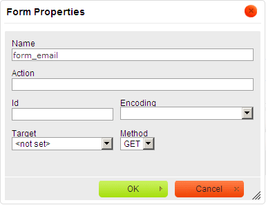
After entering the details and clicking the ‘' button, a red dotted outline will appear in CKeditor. All the following form elements need to be defined within this outline, as well as the visual layout of the form elements.
Once that has been defined, the hidden fields can be defined which provide functionality to the form. First, the form has to be told that it needs to send an email. Using the (Hidden) button, enter the following details into the dialog:
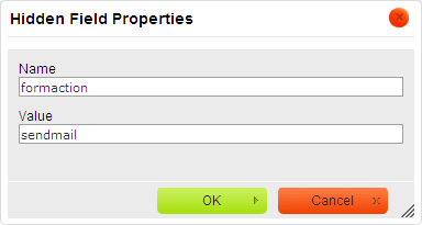
To add the subject line for the email that will be sent, add another hidden field with the name ‘subject':
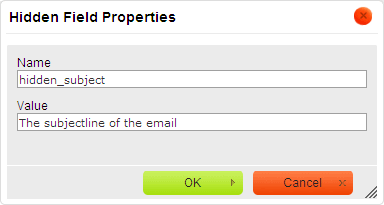
This form will have two fields, ‘name' and ‘email', and both need to have a value before the form can be entered. To accomplish this, the ‘mandatory' hidden field needs to be used, as follows:

To enter the ‘name' input field, use the button and enter the details:
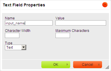
And another input field for ‘email' similar to the above one.
Also a submit button is needed, for which the button is used. Enter as follows:
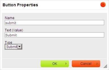
Please note that Type is set to ‘Submit'. The value of ‘Text (Value)' will be used as the text to display on the button.
Once this has been created, the resulting form inside CKeditor could look like this, depending on what visual layout has been created:

And when viewed inside Iguana (using the ‘orange' theme):

Due to the fact that the ‘mandatory' hidden field is set, a warning will be displayed when one or both of the input fields are not filled in:
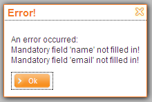
Otherwise the form will be submitted and an email with the entered subject line will be sent.
13.7.2 Full example : launching a URL
In this example a form will be created which will launch a URL. The form will contain one input field in which a search term can be entered. After submitting the form, Google will be opened showing the search results for the entered search term.
First the correct form action needs to be set up, with the ‘openurl' value:
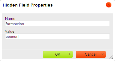
This way the form knows that it needs to launch a URL. Now the URL needs to be defined, using a hidden field, as follows:
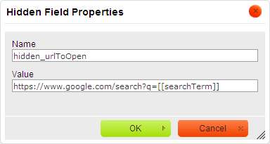
Note that this URL contains a piece of text ‘[[searchTerm]]'. This part of the URL will be replaced by the value of the input field ‘searchTerm', so this input field needs to be created as well:
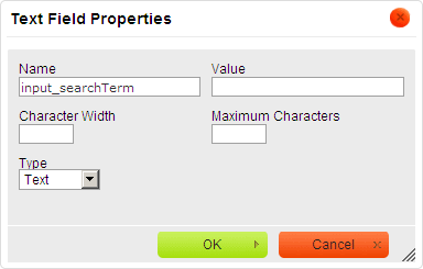
A submit button also needs to be defined, as described in the first example. Once everything has been set up including the layout, the form could look like this inside CKeditor:
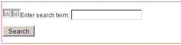
And when viewed inside Iguana (using the ‘orange' theme):
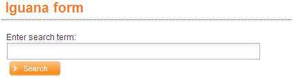
When the text ‘Iguana' is entered into the input field and the ‘Search' button is pressed, the URL ‘https://www.google.com/search?q=Iguana' will be opened in a new browser tab.
13.7.3 A more complex example : the photo competition
More complex functionalities are also possible. A good example is a photo competition form which was created for the Bibliotheek Breda site: http://www.bibliotheekbreda.nl/iguana/www.main.cls?surl=fotowedstrijd. Library customers could win a prize in an online competition: they could select, for each photo in a set of twelve, from a list of possible titles (“select the correct title for each photo”). After making their selections, they could email their submission to the library.
Please note that this site, and the form, was created in Dutch. The page showed a form with a grid of images and a dropdown box below each image, from which a title for each image could be selected. Finally it also had a more conventional set of input fields below the grid to enter details and submit everything. A resized screenshot can be seen below (including an opened dropdown):
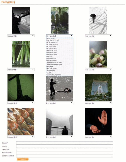
To give an idea of how this layout was accomplished, here is a section of how it appears inside CKeditor:
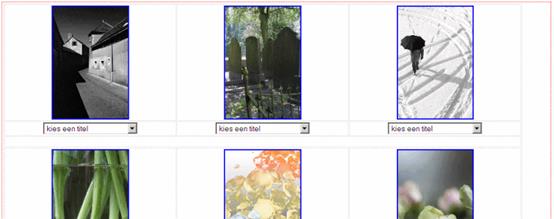
As can be seen by the light-grey lines, a table was used to place the images and the dropdowns in a grid. For each image a dropdown was created which differed in only 1 aspect, the name that was given to it. Each dropdown had a unique name, select_foto1, select_foto2, select_foto3, etc. These were set up as follows, with a different ‘Name' for each, but with the same options:
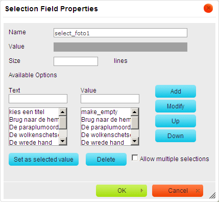
All of the dropdowns were mandatory, as well as a number of the regular input fields. The ‘mandatory' hidden field was used for this:
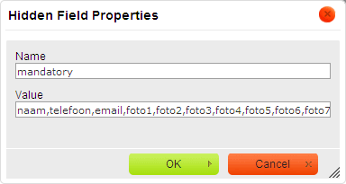
There was also a requirement to list the submitted data in a particular order inside the email. This can be accomplished using the ‘order' hidden field, as follows:

Please note that at this point all of the possible fields needs to present in the Value of the ‘order' hidden field, as explained in the paragraph on ‘order'.
The form also displays a custom message when it has been submitted successfully. This was accomplished using the ‘success' hidden field:
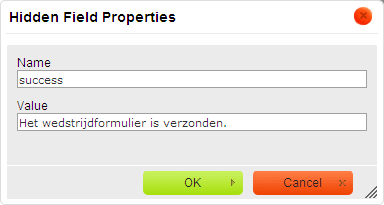
· Document control - Change History
|
Version |
Date |
Change description |
Author |
|
|
1.0 |
August 2011 |
Creation |
|
|
|
1.1 |
September 2011 |
Added sections on iFrames and Forms (included document from EdwinH for the latter topic) |
|
|
|
1.2 |
December 2011 |
Partly rewrote the introduction ; Removed the section on Search Boxes (obsolete) ; Moved the section on Direct search to the chapter on Search |
|
|
|
1.3 |
December 2011 |
Removed the chapter “Search (complete)” |
|
|
|
1.4 |
December 2011 |
Processed comments from EdwinVDG |
|
|
|
1.5 |
December 2011 |
Added section on WebForms examples |
Edwin Heijmen |
|
|
1.6 |
January 2012 |
Filled in multiple outstanding (minor) topics, e.g. screen shot examples for animation types ; added information on Iguana specific Rich Text Editor features |
|
|
|
1.7 |
January 2012 |
Added header |
|
|
|
1.8 |
January 2012 |
Reviewed |
|
|
|
1.9 |
January 2012 |
Reviewed |
|
|
|
1.10 |
January 2012 |
Layout changes in context of automated link generation |
|
|
|
2.0 |
May 2012 |
Reformat for online help doc |
|
|
|
3.0 |
November 2012 |
Added screen shots, guidelines, more explanations; reformatted |
|
|
|
3.1 |
April 2014 |
Note on animations from savelists; subtitles for RTI's |
|
|
|
3.2 |
August 2014 |
Selfcheck widget now for loans & returns; more on animations, submenus |
|
|
|
4.0 |
April 2016 |
Scope on home institution for animations; new version of CKeditor |
|
|